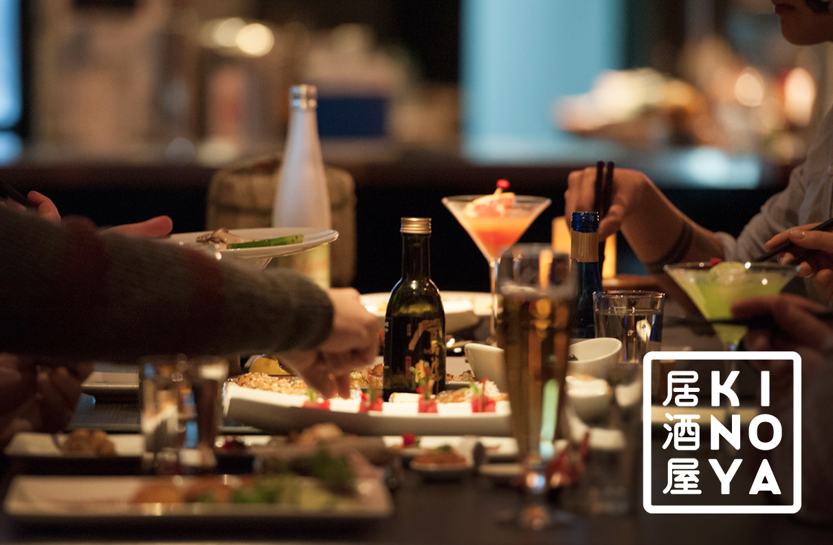
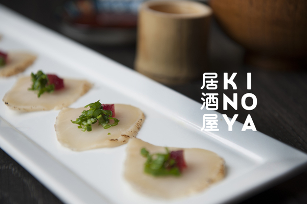
Kinoya is placed in Montreal and it is an authentic 'isakaya' (居酒屋). Literally, it means sake shop, where you can find zones with modern occidental furniture and other ones with traditional japanese tatami. An 'isakaya', normally, is a place to go after work and where you can find both food, to share, and drinks.
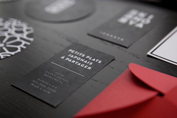
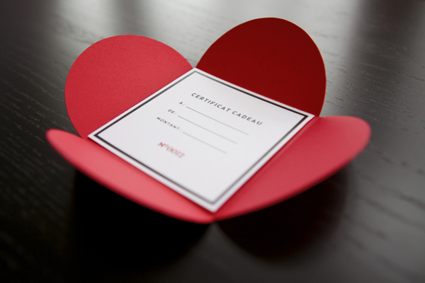
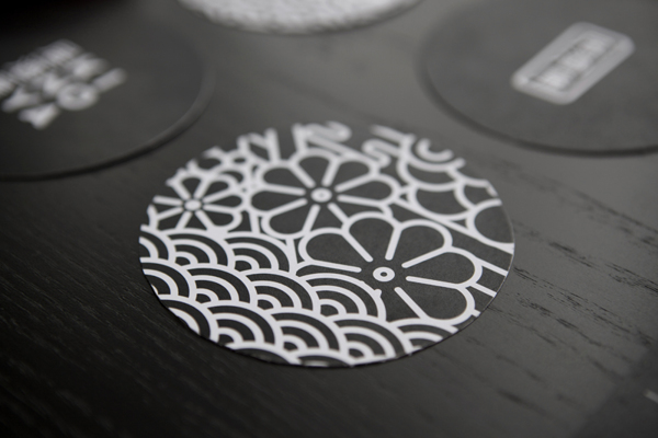
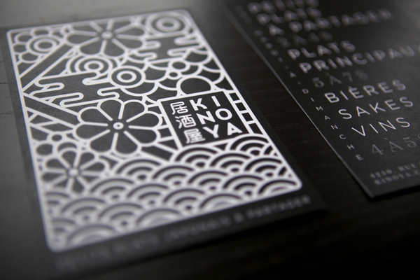
To keep the japanese minimal essence, the colors' palette of the branding is based on the traditional Akachôchin lantern, which is red and there is written 居酒屋 in black mixed with the purity of the white. Every piece like the food menu, the gift card or the drink menu are sober and maintain the information to the lightest expression as possible.
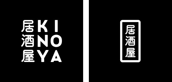
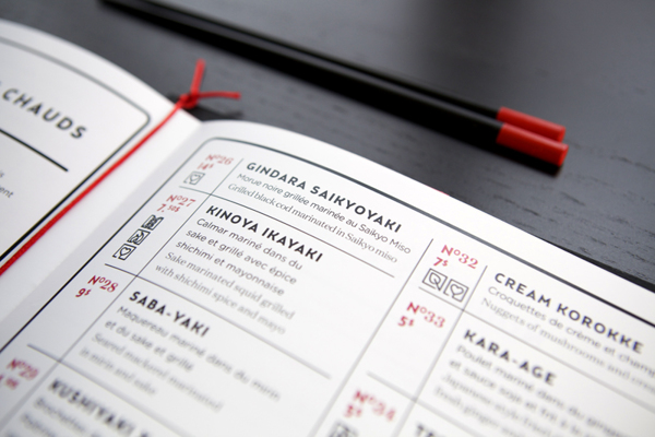
As there is a need to show the name of the dishes in 3 languages (the original in Japanese, in French and in English) there are 3 different typefaces used in the menu: a thick sans-serif, which is used also in the logo; a thin sans-serif and a thin serif typeface. The 3 japanese characters (kanji) are a lettering with rounded endings and adapted to the height of the latin letters for KINOYA in the main logo.
Véronique Lafortune / Canada / via: Behance