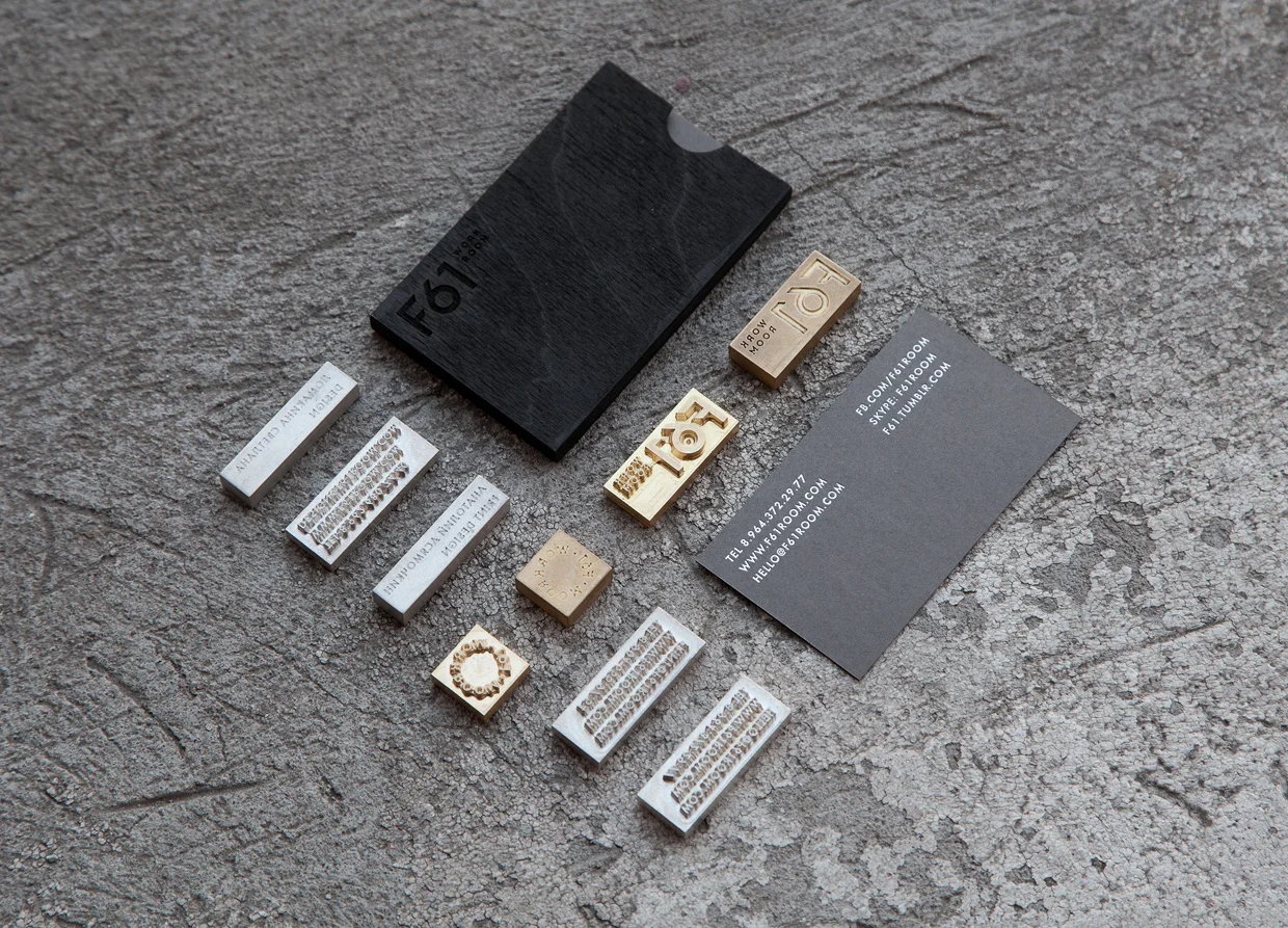
F61 is a printing studio Placed in St. Petersburg based on minimalism combining traditional and analog techniques of printing, type and the beauty of simple forms, natural materials, good paper mixing it with experiments and challenges.
“We were inspired by the print machines schemes: circles, cylinders, parallel lines, clear geometric shapes. Black-and-white color palette of the style gives it a finished strict look and stands out from the traditional printing companies. Tag line EXELLENCE OF PRINT DESIGN speaks for itself and reveals the philosophy of the studio.”


They took the branding to the highest level just mixing the successful logotype with a very clear geometrical basis jointly with the exclusive use of a typographic system where predominates the employment of black together with grey and white.


By defending their professionalism with printed materials, they adapted their logo, contact info and tag line to their stationery with techniques using ink either gravure and stamping processes.


The website conception is just the digital translation of their know-how and the way they treat the minimalism on physical elements, always using desaturated pictures combined with a black, grey and white palette. In this medium, they combine the main sans-serif typeface with a secondary one which is a modern serif with few contrasts in italics for big titles and running text.


Pavel Emelyanov (Eskimo Design) / Russian Federation / via Design made in Germany