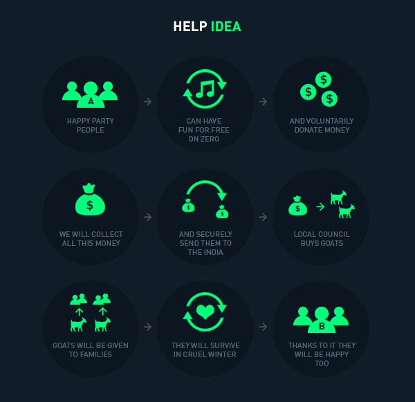
Branding for ZERO Festival (Sept.2013) – Electronic music & Beneficent event to help Tibetan people. The main idea was to give free entrance to a Drum'n'Bass and Techno music festival placed in Brno, the second most important city in the Czech Republic, and receive donations from the attendants to aid people from rural villages from the Tibet buying several goats and give them a way to survive to hard winters.
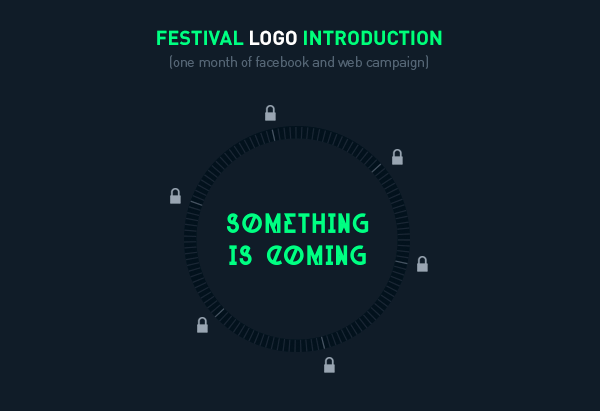
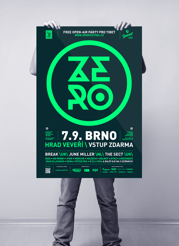
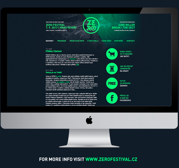
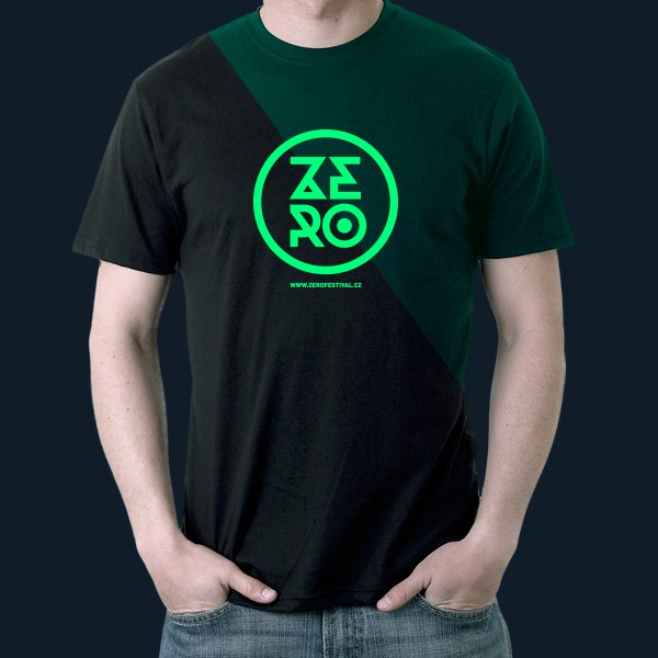
For that cause, it was developed an entire branding system based on a logo for the festival, posters, a website to explain the event and all the information related to international DJ's attending to the festival, digital artworks and banners and a social media campaign to reveal during one month the strategy to attract public's attention.
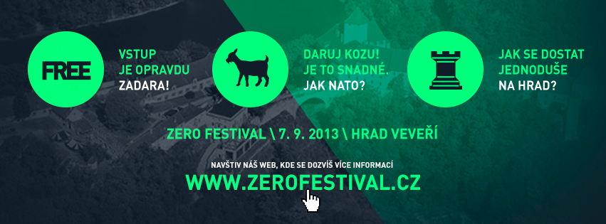
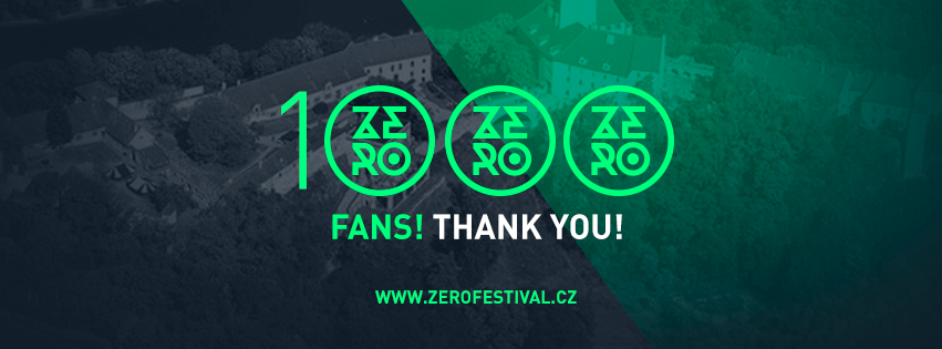
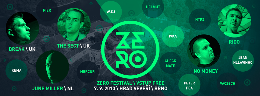
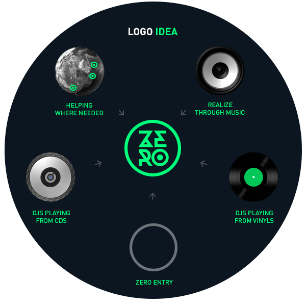
The logo is developed with a trendy and contemporary bold sans-serif typeface with geometrical shapes – which fits perfectly for an electronic music festival. The unique typeface chosen for text is the well-known DIN, which achieves its perfect goal of hierarchization between different kinds of information by different styles, colors and sizes. The basic form is the circle which has relation with the cd's, the vinyls, the speakers, the Earth and the zero. The main color palette is executed with a fluor green combined with black, white and monochromatic or greyscale pictures.
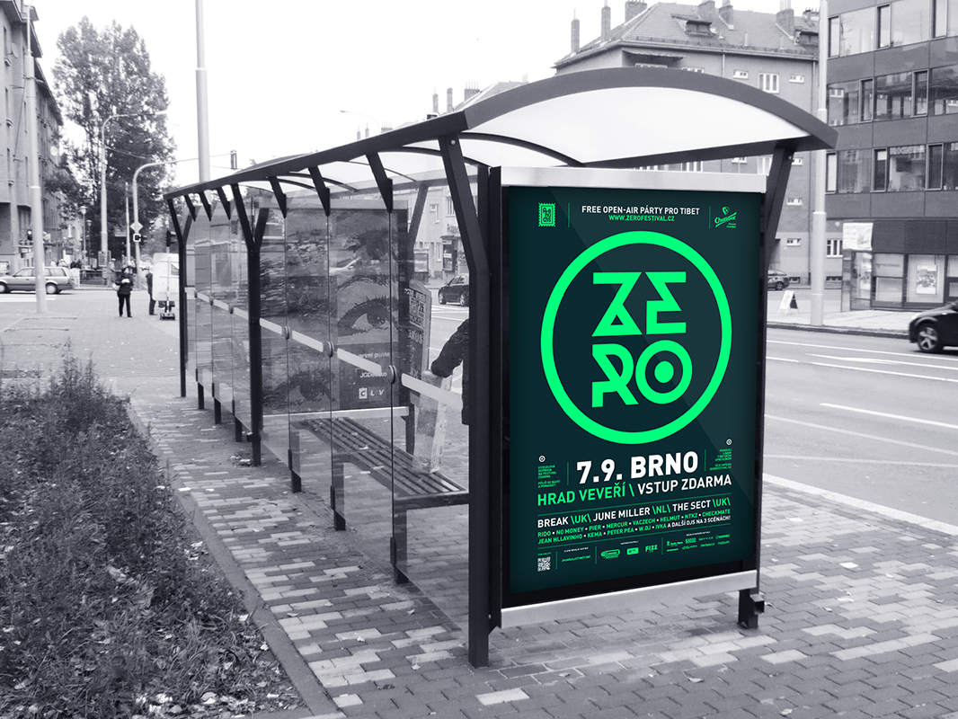
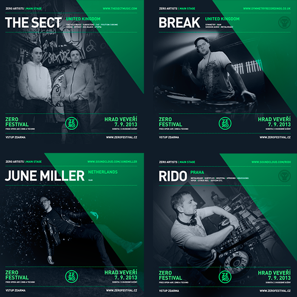
A set of icons sustains the infographics that explain clearly in the social media artworks and into the website which is the aim of the festival. Every graphic composition combines a part of black and white backgrounds and another part of a green glazed and inclined mask above the image or the background which gives coherence to all project.
Jiří Chlebus / Czech Republic / via: Behance